I have been looking the different fonts that I could use for
both my title and for my quotes. On a website called Dafont which is a place where you can download font to use. I have found four of each of these and they
are shown here below. First is the titles, when i was looking for title font i was looking for a font that was a bit blockly, maybe a like more rounded as well. I want a bold type of font. The different fonts for the title are shown here below they all say turn it up so that you can see what the font would look like with the name of my magazine. The names of what the fonts are called is above the T on each of the fonts below.When looking at these fonts if you want to see them bigger then click on the fonts as they will be come full screen. So here are the title fonts:
I really like this first font as I feel that it has a nice blockly look to it. I also think that the same of the letters looks really good.
I like most of this font but I don't like the R and the P. As they look like they don't match the rest of the font, so this is why I would not be such if I would use this font.
This font has a slanted look to it which I quite like but I'm not sure if this would look right on my front cover for the title. I also like the way that this font looks like it is in bold when it is not.
This font looks slanted as well like the font above but this one look less slanted but the T looks a lot more slanted than the other letters. I feel that the N looks a little odd as it is curved and N's normal have very pointed, not curverd.
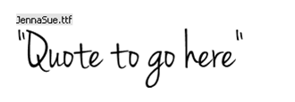
So the next fonts are fonts that i feel would be good to use when i put quotes on picture and just quotes in general. Again i have four different fonts, the bottom font is not two it is one font there is just an extra one shown what that font looks like when it is in bold. Again the names of the fonts are above the Q. Here is the quotes fonts:
This first font here has a nice handwrtitten feel to it and I really like it but there is one thing that i don't like which is the lower case q. There may also be other letters of this font that I do not like


No comments:
Post a Comment