Welcome to my AS Media Blog, this is a blog which follows the journey of the making and also the planning of my music magazine. This is the coursework part of my AS Media Studies, which I have to make a music magazine for. Here are the main Posts that I have done:

School Magazine- this was a preliminary task
Initial Ideas- this has all of the ideas that I had for my music magazine at the start of this project
Rough Cut- this was my first draft of my music magazine
Rough Cut Feedback- this is the feedback that I got from my target audience on what they through of my first draft of my music magazine
Final cut- this is my final magazine after I have improved on the feedback from my target audience
Evaluation- this is an evaluation of my music magazine and also this project as a whole

Thursday, 29 March 2012

Week beginning the 25th


This week I have been continuing the making of my music magazine. I have mainly been focusing on my contents page for the first half of the week. I have almost done the entire contents page the only thing that I have not done is put my pictures on my contents page this is because I have not taken my pictures yet. I will be taking my picture sometime next week. The Easter holidays starts after today I am not in school for the next two weeks. So I will be still working on my magazine, I will also be taking my pictures. 

I have also done some work on my double page spread, I have done the layout. I started doing some more work on this from about Wednesday; I have been doing bits of my double page spread and also the contents page. I have put in my changed article I still think that I need to do some more work on my article, in the Easter holiday. I have also put in quotes and the introduction. Another thing that I have done is the background colour. The things that I still need to do on my double page spread through making up a name for the double page spread and I also need to put in the picture, after I have taken it. I have not yet put the picture on the front cover and also the rest of the articles. I also started to do a small amount of work on front cover. I have done:

  • The background colour
  • Title
  • Added the barcode with the information above it
  • The line on the top of the front cover
  • Two articles
The deadline for the final cut of my music magazine is Tuesday 24th April. So I have the two weeks in the Easter holidays, a week and about two days after I come back. This is then when this magazine has to be finished by, as then it has to be handed in. After that I then have to have my blog finished for Tuesday 1st May and after that there is the evaluation deadline which is on Tuesday 8th May. This is then my music magazine finished.  

Wednesday, 28 March 2012

Fonts I'm Using


I have chosen the fonts that I want to use for my music magazine, with the help of my my target audience. So the fonts that I will be using are:

 I will be using this font for the title on the Contents of my magazine and also the word contents on the contents page. I will also be using this for the title on my double page spread.
The font that I will be using for the actual font for all of the writing and the article is this one. My target audience really likes this font. They said that this font, would be a font that they would want to read the magazine in.
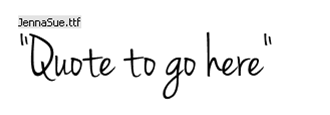
 This is the last type of font this one will be using this one will be for quotes. I really like this font and so does my target audience. It has a really hand written feel to it.


Monday, 26 March 2012

Article Font

There are many different fonts that I could use for my magazine, I have chosen these four her below, to choice from to be the font of my article. The names of the fonts are above the A. The first font is one font but it just shows the same font in bold so then this makes there look like there is two not one fonts. I have also done a post on Title font and Quote font.  So here are the four article fonts:

This first font I really like as it looks like somebody's hand writing.I like the bold version of this is also really nice but I feel that the bold would not be good to use for the article but it may be good to use for the questions.

This second one I think looks okay but I don't think that I will be using this one.As I feel that this font looks like it has been but on bold when it has not as it is very dark. So this would be one of the reasons that I would not want to use this font.
This one I feel that I may use as this one looks a lot like a normall font that you would get for an article. I feel that this is the same with the last one as well but that one has more of an handwriten feel to it.


Title and Quote Font


I have been looking the different fonts that I could use for both my title and for my quotes. On a website called Dafont which is a place where you can download font to use. I have found four of each of these and they are shown here below. First is the titles, when i was looking for title font  i was looking for a font that was a bit blockly, maybe a like more rounded as well. I want a bold type of font. The different fonts for the title are shown here below they all say turn it up so that you can see what the font would look like with the name of my magazine. The names of what the fonts are called is above the T on each of the fonts below.When looking at these fonts if you want to see them bigger then click on the fonts as they will be come full screen. So here are the title fonts:

I really like this first font as I feel that it has a nice blockly look to it. I also think that the same of the letters looks really good.
I like most of this font but I don't like the R and the P. As they look like they don't match the rest of the font, so this is why I would not be such if I would use this font.
This font has a slanted look to it which I quite like but I'm not sure if this would look right on my front cover for the title. I also like the way that this font looks like it is in bold when it is not.
This font looks slanted as well like the font above but this one look less slanted but the T looks a lot more slanted than the other letters. I feel that the N looks a little odd as it is curved and N's normal have very pointed, not curverd. 
So the next fonts are fonts that i feel would be good to use when i put quotes on picture and just quotes in general. Again i have four different fonts, the bottom font is not two it is one font there is just an extra one shown what that font looks like when it is in bold. Again the names of the fonts are above the Q. Here is the quotes fonts:

This first font here has a nice handwrtitten feel to it and I really like it but there is one thing that i don't like which is the lower case q. There may also be other letters of this font that I do not like


Q Layout

I have been looking at some Q magazines as this is the genre of music magazine that I would like to do. So here are some of the magazines that I have been looking at to help me with ideas for the layout of my music magazine.First is the double page spreads, then the contents page and then last the front covers.

For my double page spread I have to have three colunms so these top to are the most like the type of article layout that I will have. 


Saturday, 24 March 2012

Week beginning the 19th


On the Monday I was finishing of my first draft of my music magazine, on the Tuesday I then handed in my first draft. On the Wednesday I had my target audience have a look at my first draft of my music magazine so that I could see what they through of it and also what they liked and did not like. So that I could see what I needed to change on my final magazine. Here is a link to my first draft target audience feedback.
 
On the Thursday I start to remake my magazine in a way that my target audience would like more. I did this through first starting to think about the colour theme that I would use, I also through about how I would use for my photo and so on with all of the things that I wanted to change about my music magazine. On Friday I then used continued remaking my final draft of my music magazine.

Friday, 23 March 2012

Colour sheme


After asking my target audience which of the three colour schemes that I should use. I found that the best colour scheme would be the green one, but not with the black instead with the grey colour from the purple colour scheme.  I found this out by asking people which colour scheme they liked, the results are shown in this pie chart:

A lot of people put other, i then asked them why this was and they all said that they liked the green colour scheme but they wanted the grey from the purple instead of the black with the green. So here is what the colour scheme of my music magazine is: